See Growth Multiply: A Friendly Guide to Exponential Curves

Today we dive into visualizing exponential growth using approachable charts and beginner‑friendly tools. You’ll learn how to spot doubling patterns, choose clear axes, and build interactive views in spreadsheets or code, while practicing with relatable examples; subscribe for upcoming walkthroughs, and join conversations, questions, and shared experiments from our curious community.

From Steps to Rockets: Linear vs Exponential at a Glance

Start with a sketch that grows by equal steps, then plot one that multiplies by the same percentage. The first climbs steadily; the second bends upward. Seeing the contrast trains intuition, revealing how equal relative gains produce dramatic departures from predictable, gentle progress.

The Power of Doubling and the Rule of 70

Doubling turns small seeds into forests. Use the Rule of 70 to estimate doubling time from a growth rate, then compare it with actual data. Practicing these rough mental calculations builds intuition, guiding faster chart choices and preventing surprising misreads when scales change.

Why Early Changes Seem Quiet, Then Suddenly Loud

Early exponential growth often hides near the axis, appearing flat until compounding takes over. By zooming into early intervals, using log scales, and annotating key milestones, you’ll keep attention on meaningful change before the curve erupts, improving decisions while calm conditions still exist.

Simple Line Charts for First Looks

Begin with a clean line chart that places time on the horizontal axis and values vertically. Add markers, light gridlines, and consistent colors. This straightforward view builds trust, letting you introduce more advanced scales later without losing people during the crucial first impression.

Semi‑Log Views That Straighten Curves

A semi‑log chart plots values on a logarithmic vertical axis, turning equal percentage changes into equal distances. Exponentials straighten, slopes reflect growth rates, and early movement becomes visible. Practice estimating doubling time from slope lines and annotating them, so newcomers instantly read meaning from geometry.

When Bars Mislead and Axes Matter

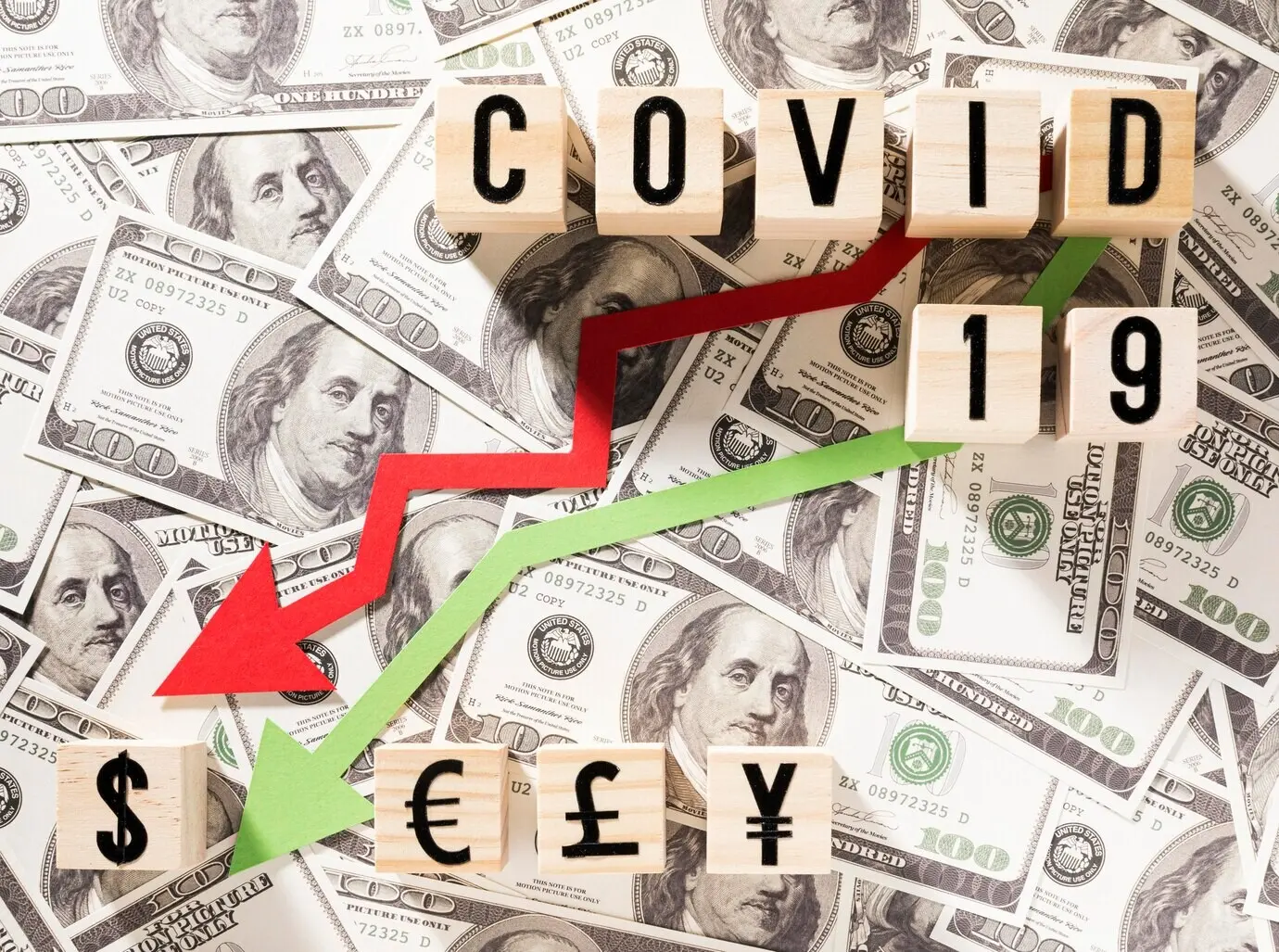
Bars can help comparisons at single moments, yet they often hide acceleration across time. When values vary by orders of magnitude, bars compress smaller periods. Prefer lines or semi‑log views, and adjust axis breaks carefully, keeping labels and ticks honest, readable, and consistent across panels.

Hands‑On in Spreadsheets

Google Sheets: From Formula to Figure

In Google Sheets, start by entering a starting value and a growth rate, then use fill‑down formulas to generate periods. Insert a line chart, enable a logarithmic vertical axis, and add data labels. Freeze headers and share the sheet so collaborators can tinker safely.

Excel: Trendlines, Log Axes, and Formatting

In Excel, create a table with time, value, and percentage growth. Insert a scatter with smooth lines, format the y‑axis as logarithmic, and add a trendline displaying the exponential equation. Use templates and named ranges to repeat experiments quickly without reformatting every new dataset.

Common Spreadsheet Mistakes to Avoid

Beware of mixing percentages and absolute units, forgetting zero baselines when appropriate, or labeling axes inconsistently across charts. Avoid heavy gridlines, decorative gradients, and busy legends. Keep annotations crisp, highlight only what matters, and verify formulas by spot‑checking expected results using mental math estimates.

Desmos and Sliders for Instant Insight

Desmos lets you bind parameters to sliders, then watch curves respond instantly. Annotate intersections, shade regions, and export images for presentations. By toggling multiple growth rates, students and teammates quickly grasp how tiny changes in percentage compound into large differences across surprisingly few periods.

Python and Notebooks for Reproducible Exploration

Jupyter notebooks pair narrative with executable code. Using Python libraries like Matplotlib, Seaborn, or Altair, you can generate semi‑log views, compute doubling times, and keep experiments versioned. Share notebooks so collaborators rerun cells, tweak assumptions, and validate insights without rebuilding everything from scratch.

Interpreting Results Without Getting Fooled

Numbers persuade only when presented honestly. We’ll examine pitfalls like cherry‑picked ranges, axes that exaggerate, and mismatched units, then practice transparent labeling and clear uncertainty cues. Thoughtful choices protect credibility, encourage healthy skepticism, and help audiences make timely decisions grounded in understandable, reproducible evidence.

Everyday Scenarios You Can Try Today

Small, playful experiments cement habits. We’ll practice with money that grows, shares that spread, and circuits that shrink. You’ll set up data, visualize progress, and discuss results with friends. By repeating weekly, you’ll see patterns faster and contribute examples, tips, and questions to fellow learners.

Savings That Snowball: A Tiny Deposit Challenge

Open a new sheet, deposit a tiny weekly amount, and apply a constant percentage growth as interest. Chart balances on both linear and log axes, then journal how perceptions differ. Share screenshots with our readers, comparing strategies and celebrating how persistence compounds even modest beginnings.

Viral Spread Simulation Among Friends

Model a simple contact process where each person invites two friends per round. Plot cumulative participants and discuss what interventions change the curve. Reflect on responsibility, clarity, and context while learning how shape, timing, and rate interact to produce outcomes with real‑world consequences.

Tech Trends on a Log Scale

Gather processor counts for historical chips, then plot on semi‑log axes. You’ll see near‑straight segments illustrating steady improvement. Annotate discontinuities, note architectural shifts, and debate future limits. Converting technical trends into accessible visuals helps non‑specialists join conversations that otherwise feel closed to newcomers.
Xutimupifame
Privacy Overview

This website uses cookies so that we can provide you with the best user experience possible. Cookie information is stored in your browser and performs functions such as recognising you when you return to our website and helping our team to understand which sections of the website you find most interesting and useful.